Account Dashboard
Building the New Account Dashboard
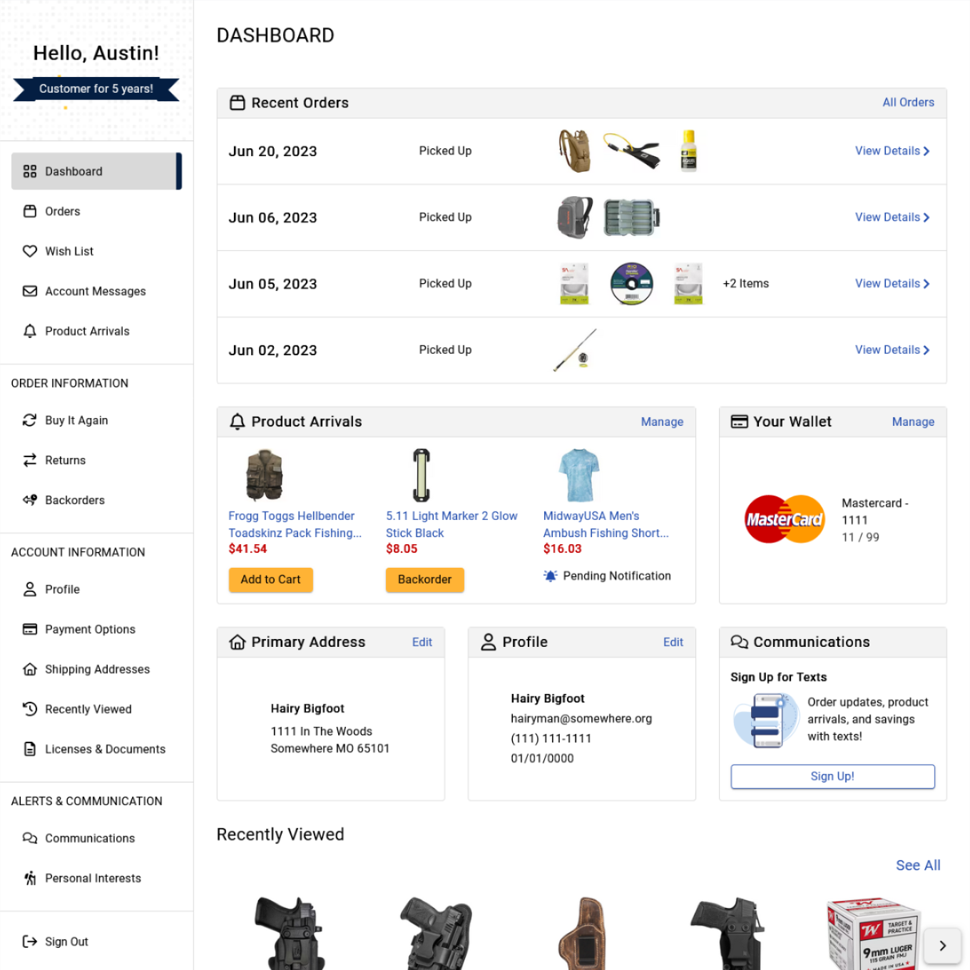
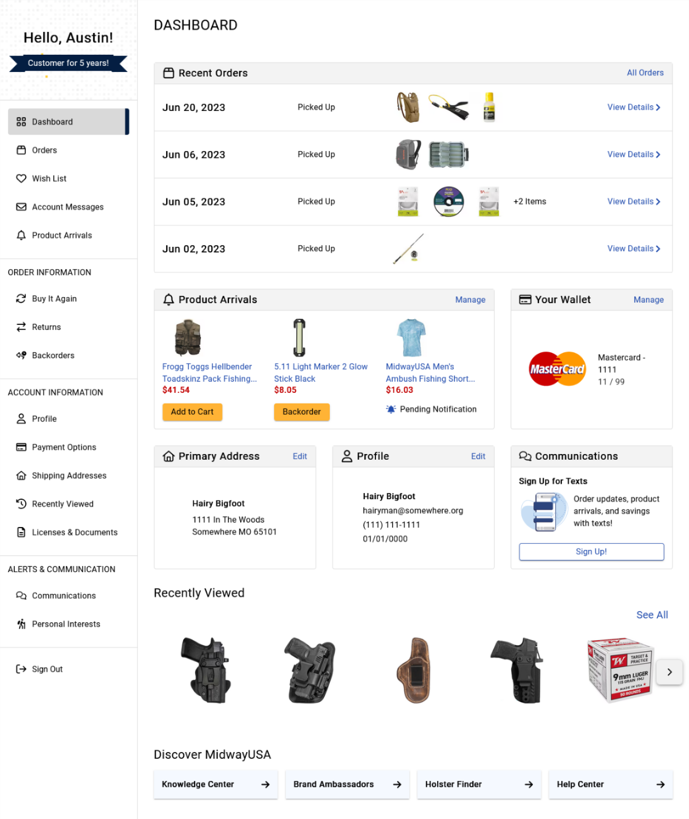
Building the account dashboard page was an exciting project and an opportunity to build a brand new page for users to interact with their account information. Previously when coming to their accounts users would be greeted with their profile information. Now, users are greeted with a new account-wide navigation, recent order information, a preview of new product arrivals, and and ease of access to their account information.
My Role
I was the UX Developer on the project for creating the account dashboard page, so I was pivotal for shaping the digital experience of the page and ensuring an accessible experience. I collaborated closely with both the designer and the two web developers during this project, bridging the gap between technology and design to create a user-friendly experience. During this project I created the front-end styles with SCSS, and ensured that the creation of the DOM would provide an accessible experience to all users.
Creation Through Iteration
1. Navigation and Recent Orders
The first release contained the new account-wide navigation and the recent orders card on the account dashboard. The new navigation features a section showing the user who they are currently logged in as, and a little banner featuring how long they have been a customer. The navigation links are spread out and clearly discern what page the user is currently viewing. The page links are organized by category by user usage and grouped by what information the user will find on those pages.
Complimenting the new navigation the dashboard features a user’s recent orders card. This card provides a quick and convenient way to view all order information, and displays a quick summary of recent purchases. The card shows order date, current order status, and a preview of the ordered products. Users can dive deeper into each order by clicking on an order, where they can track their shipment, access full order details, and request a return or exchange effortlessly.
Quickly after releasing the dashboard, we decided to add a users recently viewed products component to the page. As well as convenient links to other pages that users may have an interest in.
2. Adding Account Information
The next step to the account dashboard was adding in user account information. This featured three cards, one to show the default card information, one to feature the user’s default address, and one to show profile information. Each of these cards provide the user a quick overview of their personal information of their account, and gives them a quick way of updating any existing information.
3. Product Arrivals and Communications
The final stage of the project was a card to feature any pending or active product arrival notifications, and a communications card to show either a text sign-up promotional or current communication settings for the users account. When products are available for purchase the user can select the ‘add to cart’ functionality to quickly add the product to their cart.
Additional Features
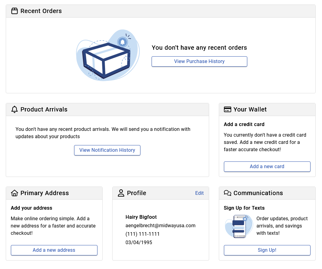
In situations where the user has no current information to display, each card provides encouragement to finish adding information to their account or encouragement to begin shopping. The absence of data should not be a dead end for user, but rather an opportunity for engagement towards meaningful actions. This gives each card a call-to-action to either complete the account creation process to speed up their next checkout, or to begin the shopping funnel.


